I spend a lot of time looking at websites.
And usually, when a client comes to me for a rebrand, they want to talk about the aesthetics first. They want to debate on the colors. They worry about whether the logo should spin or if the hero image should be a drone shot of a city skyline.
I get it. We all want to look good.
But while we are obsessing over whether the blue should be “Midnight” or “Royal,” the visitor has already left.
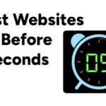
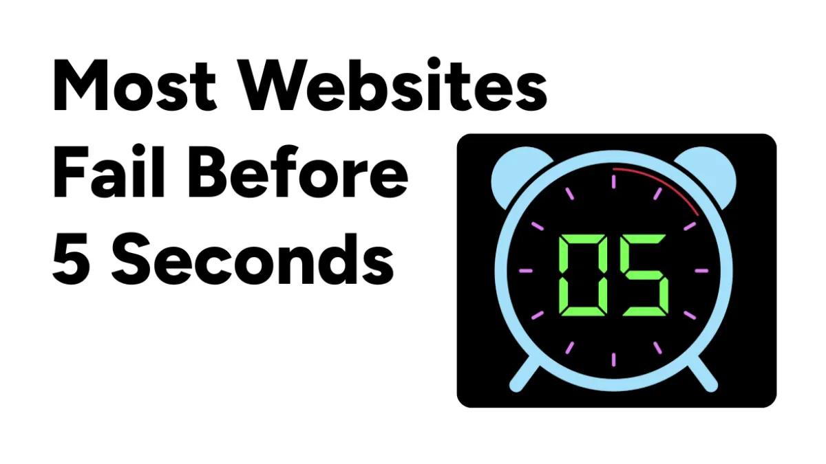
The 5-Second Rule
There is a hard reality in digital marketing that most designers ignore.
It isn’t fair. It isn’t logical. But it is true.
When a stranger lands on your website, you don’t have their attention. You have their skepticism. They are hovering over the “Back” button, looking for a reason to leave. And they usually make a gut check in about five seconds.
If they can’t figure you out in that time… you’re done.
The Calorie Theory
I have this theory about calories.
I think every time a user has to think, they burn a mental calorie. Reading a headline is maybe one calorie. Searching for the “Contact” button is five. Trying to decipher a vague metaphor is ten.
Humans are wired to conserve energy. If your website forces me to burn calories just to understand what you sell, my brain tells me to bail.
The biggest mistake I see isn’t “ugly design.” Honestly, ugly websites convert sometime. Craigslist is ugly. Amazon is cluttered. They do just fine.
The mistake is ambiguity.
Clever vs. Clear
It’s the “Elevating Horizons” problem. You know the type.
You land on a homepage and there is a beautiful, high-res photo of a mountain climber. The headline says something like “Reimagining the Future of Synergy.”
Okay. Sounds nice, I guess. But what do you actually do?
Are you a consulting firm? A software company? Do you sell hiking gear?
I have to scroll. I have to read the “About” page. I have to work for it.
And I won’t.
We fall into this trap because we want to sound smart. We want to be poetic. But on a website, clarity beats cleverness every single time.
If I land on your site, I need to know three things before that five-second clock runs out. Who you are, what you do, and if this is for me.
If your hero section doesn’t answer those, no amount of trendy animation is going to save you.
Be a Guide
Compare “Reimagining the Future of Synergy” with something flat like “We Help SaaS Companies Scale Their Ads.”
It’s boring. It’s not going to win a design award. But it works.
It tells the right people “You are in the right place” and it tells the wrong people “This isn’t for you.”
That is respectful design. It respects the user’s time.
So, look at your website today. Really look at it. Pretend you have never seen it before. Pretend you have a headache and you are in a rush.
Open the homepage and count to five.
Do you know exactly what the business model is? Or are you just looking at a pretty picture?
If you are making your visitors guess, you are losing money. Stop trying to be an artist. Be a guide.
The art can come later.