There is an unwritten rule in web design that we all tend to follow blindly: The navigation bar belongs at the top.
It’s standard. It’s safe. It’s what every user expects when they land on a page. If you look at 99% of websites today, they follow the exact same blueprint: Logo on the top left, links on the top right, hero section below.
But recently, while working on a major project for Tru Power Data, I found myself staring at the screen and thinking: Why do we always do it this way?
Sometimes, playing it safe is the right move. But other times, safe is just another word for invisible.
Here is the story of why we took a calculated risk to break the #1 rule of website navigation design, and how it paid off.
The Project: Redesigning Tru Power Data
I was tasked with the full design overhaul for Tru Power Data, an AdTech platform. The scope was huge: I wasn’t just redesigning the public-facing website; I was also redesigning the core SaaS platform (the actual software users log into).
(A quick shout-out to the client, Chris Perruso, who trusted me enough to say, “Let’s push the boundaries.”)
As we mapped out the user journey, we noticed a friction point that plagues almost every SaaS company.
The Disconnect Between “Site” and “Software”
Usually, a SaaS company has two distinct personalities:
- The Marketing Site: This is the sales brochure. It feels open, airy, and usually has that top navigation bar.
- The Product: This is the tool. It feels dense, functional, and usually has a sidebar navigation for efficiency.
The problem? The transition is jarring. You sell the user on one experience, but when they sign up and log in, they are dropped into a completely different environment.
I wanted to fix that.
The Disruption: Moving the Menu
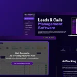
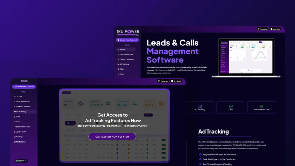
We decided to do something unconventional for the website navigation design. We took the sidebar navigation from the software dashboard and brought it out to the public website.
We didn’t just want visitors to read about the software; we wanted them to feel like they were using it.
By mimicking the layout of the actual application, we created an immersive experience. From the second the homepage loads, the visitor feels like they are already inside the app. The line between “marketing” and “product” is blurred.
The Result: Psychology in Action
This wasn’t just a stylistic choice to be “edgy.” It was a psychological strategy.
The shift reduced mental friction. When users eventually converted and logged into the platform, they didn’t have to learn a new layout. They already felt “at home” in the interface because they had been navigating it the whole time they were browsing the public site.
The Lesson
Changing the website navigation design was a risk. People resist change, and confusing a user is usually a death sentence for conversion.
But in this case, the risk was calculated.
It taught me that sometimes, the “best practices” are actually just “common practices.” If you have a strong strategic reason to break a rule, you shouldn’t be afraid to break it.
You can see the website live here: https://trupowerdata.com/
I love testing unconventional UX patterns. If you want to know if your current website is costing you conversions, reach out to me and let’s take a look >>> Schedule a Call